📋 Overview
The Western Esports & Gaming Association (WEGA) is a community uniting students passionate about video games. Comprised of two key departments—WEGA and Western Esports—we host diverse events, including tournaments, casual gaming nights, and social gatherings. Western Esports manages our competitive teams, spanning popular titles like League of Legends, Valorant, Overwatch and more. As the VP of Design, I am in charge of overviewing the design team and visual branding of WEGA. Our team is in charge of creating promotional graphics for club events (tournaments, game nights, socials), and designing all broadcasting/streaming assets and club merch.

⚠️ The Design Challenge
HMW reshape our club's brand to dismantle gaming stereotypes and foster a thriving esports and gaming community at Western University?
In user interviews/tests, participants questioned the rationale behind “Recommended” builds, skipped text-heavy sections, and missed important tools hidden behind tabs. Under in-game time pressure, these issues compound, leading to increased cognitive load and slowed decision making.
Current Champion Builds User Experience
🎯 Goals
All departments had their own specific department goals but the overarching goals that we had for the club was:
Increase awareness and support for gaming and esports within Western University
Create a welcoming environment regardless of levels, backgrounds, and interests.
Establish a strong pipeline and foundation for future esports teams and departments of WEGA
💡 Solution
Rebranding WEGA to a clean, modern, and consistent branding
Through a clean, contemporary and cohesive brand, WEGA can leave an identifiable and reputable mark on campus. Although obtaining university support for our teams may be a gradual process, we aspire to challenge the prevailing stereotypes in the scene and motivate those passionate about gaming to explore the myriad career opportunities it offers.
📊 Results
Improved task completion time by 25%
Baseline vs. Post-Redesign Usability Testing showed ~25% reduction in task completion time. Given timeline and scope, the team shipped a subset of my recommendations—condensing information and standardizing build titles. I then created a handoff deck with the larger redesign, and presented it to design and engineering for post-internship implementation.

🚀 THE PROCESS
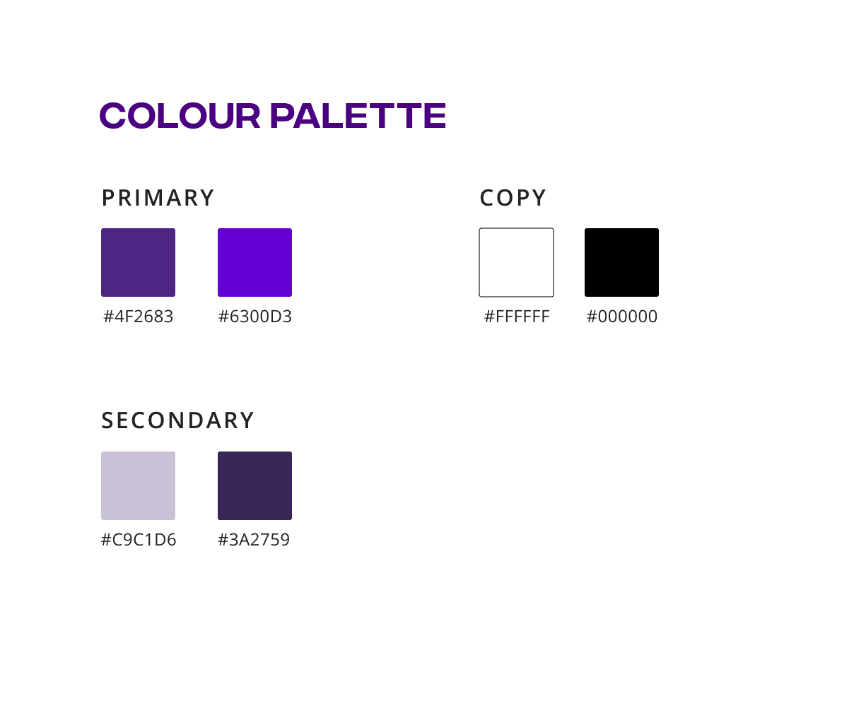
📝 Design System
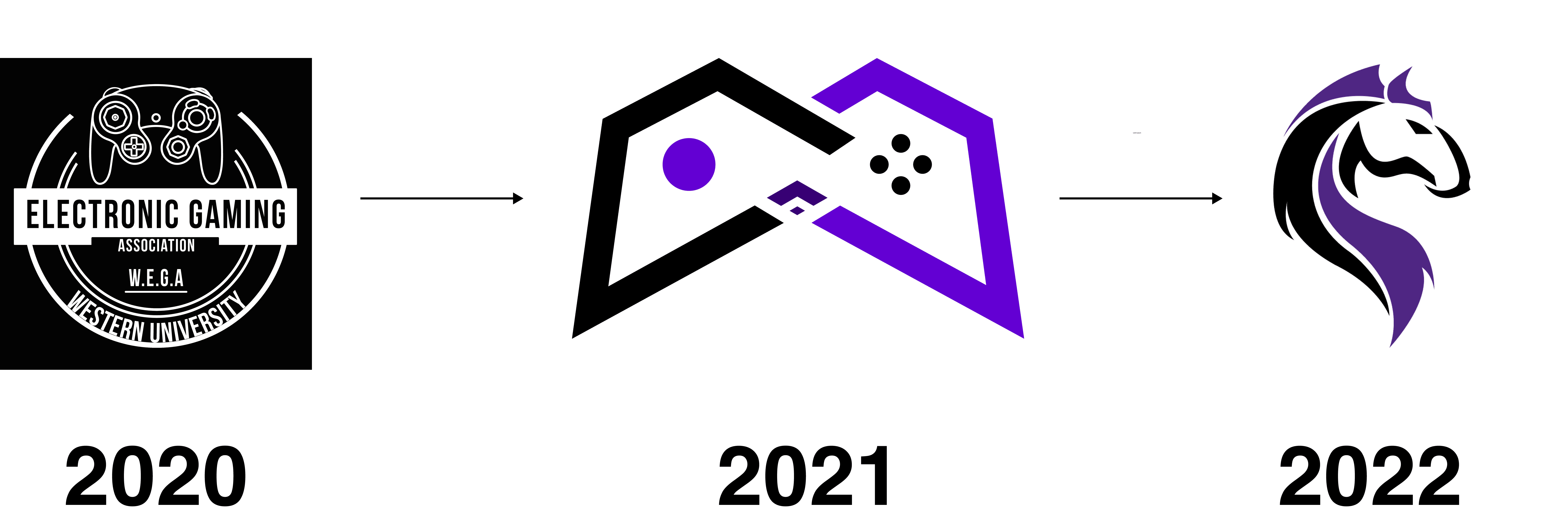
This year we decided to switch our club’s logo from the old gaming controller design to a new design based on our school’s mascot. The purpose of this change was to better represent the esports aspect of our club and to give a stronger association of our brand to the rise of the competitive gaming landscape. Traditionally, competitive gaming is seen as something much less than physical sports, the new logo combats this stereotype by introducing a sense of spirit through a mascot used by other sports teams at Western.
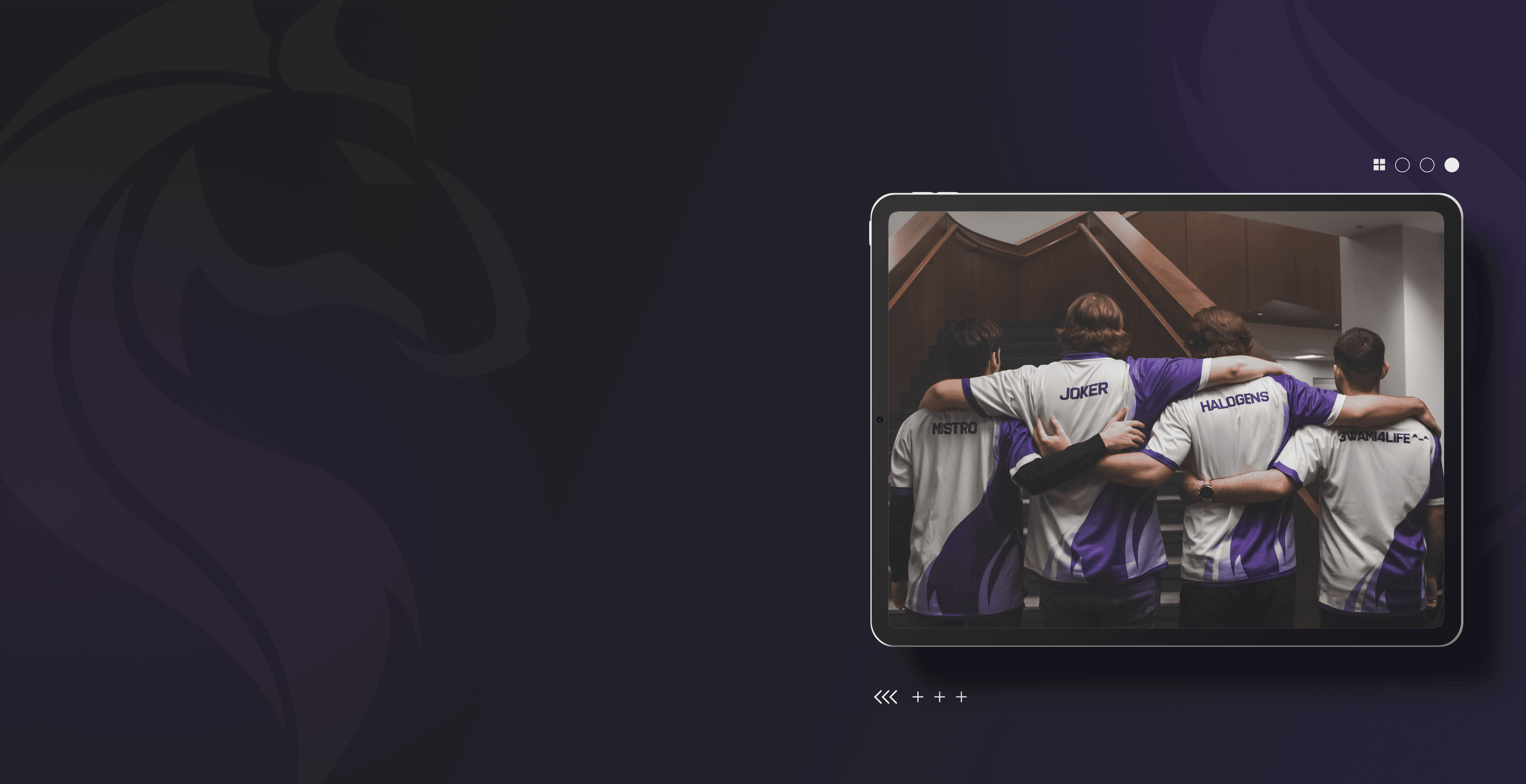
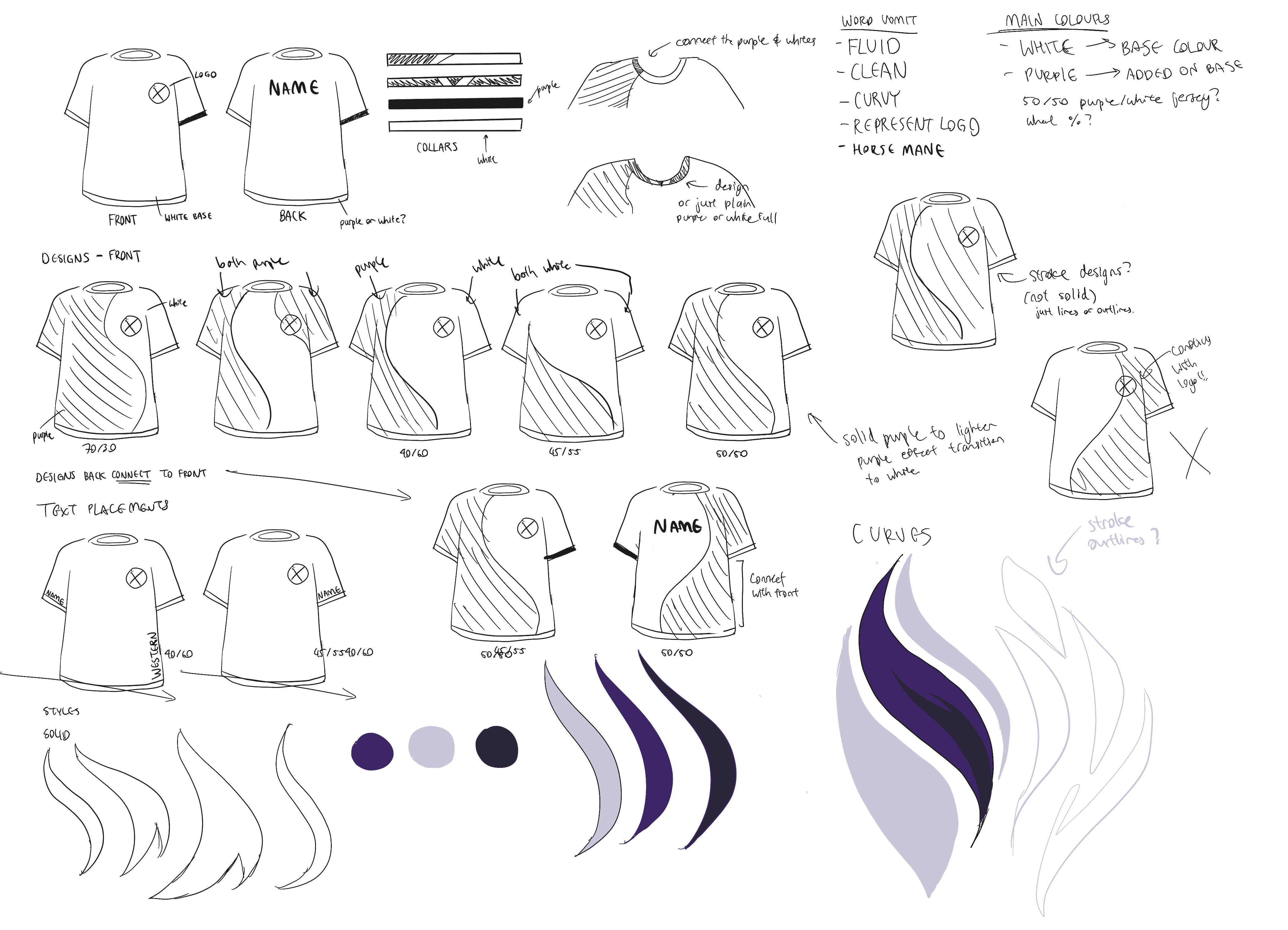
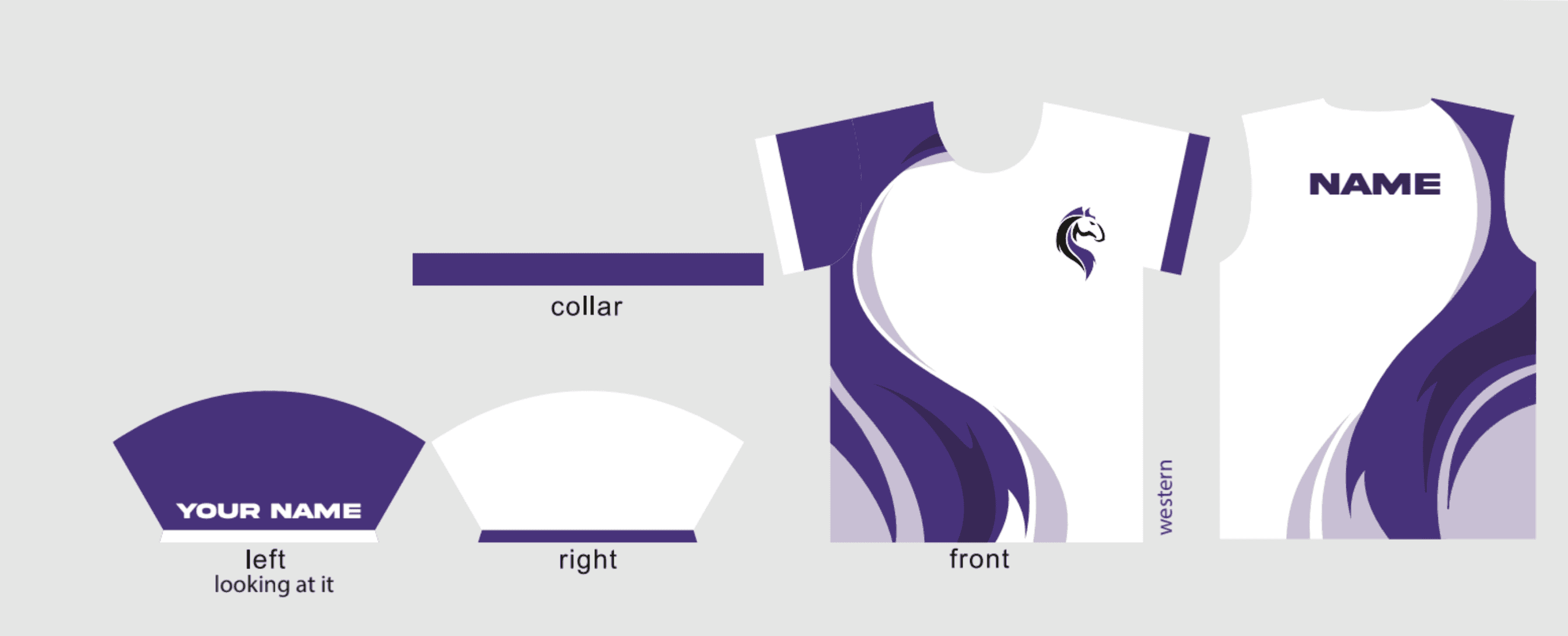
💭 Jersey Design
Creating a simplistic and modern jersey started with the use of curvy design elements to imitate the curvy design of the mane of the mustang from our school mascot. Other aspects of the jersey such as the alternative sleeve colours came from inspiration based on existing professional esports team jerseys.

✅ Other Club Merch
also worked on creating designs for our club banner, lanyard and esports flag. In order to create an eye-catching, but clean flag design, we used the curves from our logo, and shaped them into flame-like curves to represent the motivations of our esports players.

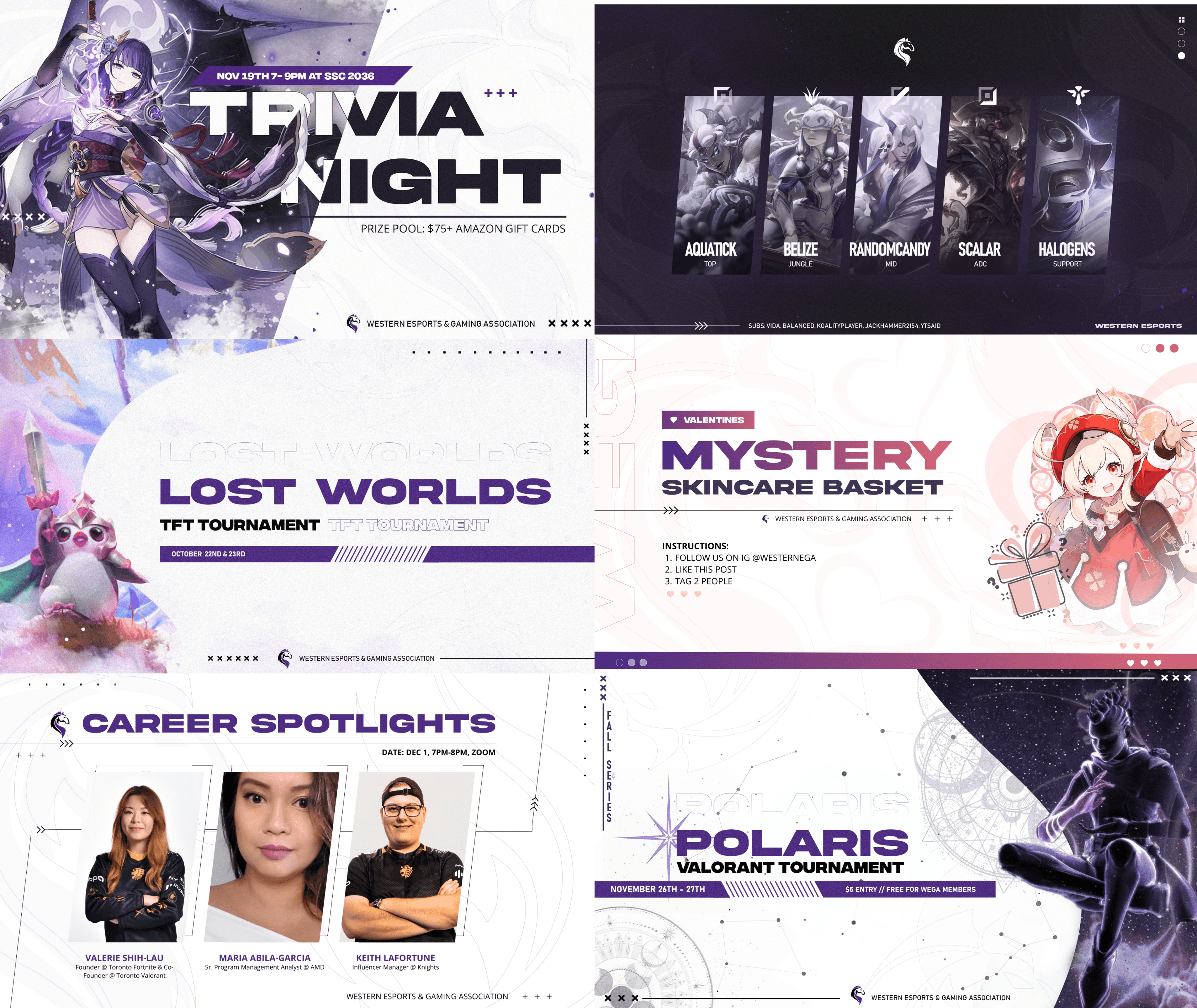
🚀 Promo Designs
Milestone 1
Standardize Build Titles and Simplify Information
Milestone 2
Add Builds Descriptions


Milestone 3
Streamline Navigation and Improve Visibility
Milestone 4
Add Personalized Matchup Insights


✨ Reflection
Aligning stakeholders goals to deliver feasible, high-impact designs
Before this internship, my product design experience was limited to personal projects and extracurricular activities. I was fortunate to receive guidance and feedback from the CEO, designers, engineers, and community teams, which helped me navigate cross-functional collaboration. Through this experience, I learned how to align priorities and goals with different stakeholders to ensure feasible and impactful design outcomes.